
spharpy.plot#
This module offers plotting functions for spherical data based on Matplotlib.
Adjusting the Plot Layout#
A common issue with matplotlib 3D axes objects is that layout-options like
matplotlib.pyplot.tight_layout or
constrained layout
don’t always work correctly.
This can cause elements to overlap, such as colorbar and axes.
To prevent this, spharpy plot functions enable passing a list of axes for
the plot itself and the colorbar. The best way to handle the layout of a
figure is matplotlib.gridspec.GridSpec.
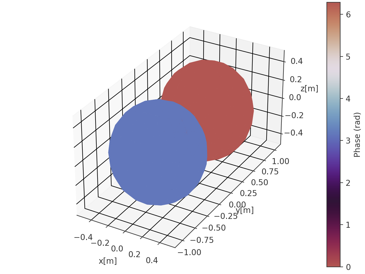
Example
>>> import spharpy
>>> import numpy as np
>>> import matplotlib.pyplot as plt
>>> from matplotlib.gridspec import GridSpec
>>>
>>> coords = spharpy.samplings.equal_area(n_max=0, n_points=500)
>>> data = np.sin(coords.colatitude) * np.cos(coords.azimuth)
>>>
>>> # Create figure and GridSpec
>>> fig = plt.figure(figsize=(9, 7))
>>> gs = GridSpec(nrows=1, ncols=2, width_ratios=[20, 1], wspace=0.3)
>>>
>>> # Create subplot axes for plot and colorbar
>>> ax = fig.add_subplot(gs[0], projection='3d')
>>> cax = fig.add_subplot(gs[1])
>>>
>>> # Plot
>>> spharpy.plot.balloon(coords, data, ax=[ax, cax])
>>> plt.show()
(Source code, png, hires.png, pdf)

Classes:
|
Colormap norm with a defined midpoint. |
Functions:
|
Plot data on a sphere defined by the coordinate angles theta and phi. |
|
Plot data on a sphere defined by the coordinate angles theta and phi. |
|
Plot the map projection of data points sampled on a spherical surface. |
|
Plot the map projection of data points sampled on a spherical surface. |
|
Plot the map projection of data points sampled on a spherical surface. |
|
Plot data on the surface of a sphere defined by the coordinate angles theta and phi. |
|
Cyclic color map for displaying phase information. |
|
Plot the x, y, and z coordinates of the sampling grid in the 3d space. |
|
Plot the Voronoi cells of a Voronoi tesselation on a sphere. |
- class spharpy.plot.MidpointNormalize(vmin=None, vmax=None, midpoint=0.0, clip=False)[source]#
Bases:
NormalizeColormap norm with a defined midpoint. Useful for normalization of colormaps representing deviations from a defined midpoint. Taken from the official matplotlib documentation at https://matplotlib.org/users/colormapnorms.html.
Methods:
__init__([vmin, vmax, midpoint, clip])- __init__(vmin=None, vmax=None, midpoint=0.0, clip=False)[source]#
- Parameters:
vmin (float or None) – Values within the range
[vmin, vmax]from the input data will be linearly mapped to[0, 1]. If either vmin or vmax is not provided, they default to the minimum and maximum values of the input, respectively.vmax (float or None) – Values within the range
[vmin, vmax]from the input data will be linearly mapped to[0, 1]. If either vmin or vmax is not provided, they default to the minimum and maximum values of the input, respectively.clip (bool, default: False) –
Determines the behavior for mapping values outside the range
[vmin, vmax].If clipping is off, values outside the range
[vmin, vmax]are also transformed, resulting in values outside[0, 1]. This behavior is usually desirable, as colormaps can mark these under and over values with specific colors.If clipping is on, values below vmin are mapped to 0 and values above vmax are mapped to 1. Such values become indistinguishable from regular boundary values, which may cause misinterpretation of the data.
Notes
If
vmin == vmax, input data will be mapped to 0.
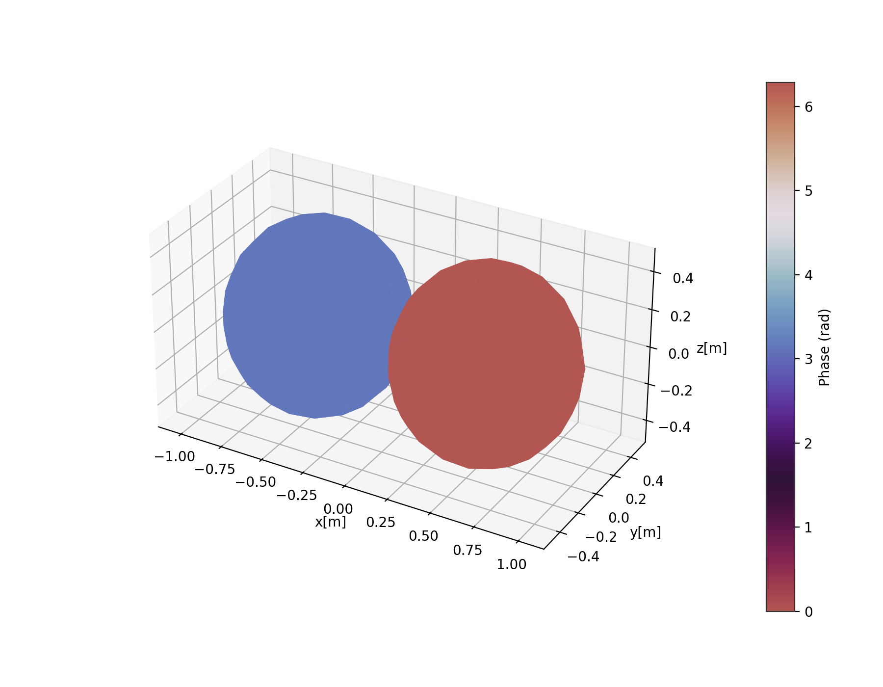
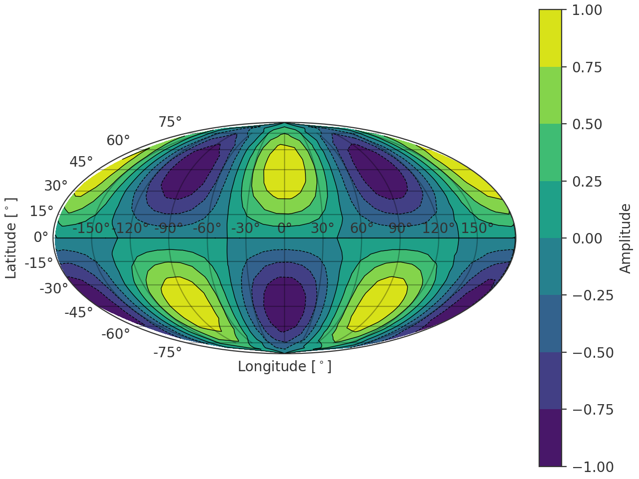
- spharpy.plot.balloon(coordinates, data, cmap=None, colorbar=True, limits=None, cmap_encoding='phase', ax=None, style='light', **kwargs)[source]#
Plot data on a sphere defined by the coordinate angles theta and phi. The magnitude information is mapped onto the radius of the sphere. The colormap represents either the phase or the magnitude of the data array.
- Parameters:
coordinates (pyfar.Coordinates, spharpy.SamplingSphere) – Coordinates defining a sphere
data (ndarray, double) – Data for each angle, must have size corresponding to the number of points given in coordinates.
cmap (str,
matplotlib.colors.Colormap, optional) – Colormap used for the plot. IfNone(default), the colormap is automatically selected based on the value of cmap_encoding:'phase'usesspharpy.plot.phase_twilight, and'magnitude'uses the'viridis'colormap.colorbar (bool, optional) – Whether to show a colorbar or not. Default is
True.limits (tuple, list, optional) – Tuple or list containing the maximum and minimum to which the colormap needs to be clipped. If
None, the limits are set to the minimum and maximum of the data. Default isNone.cmap_encoding (str, optional) – The information encoded in the colormap. Can be either
'phase'(in radians) or'magnitude'. The default is'phase'.ax (matplotlib.axes.Axes or list, tuple or ndarray of matplotlib.axes.Axes) –
Axes to plot on.
NoneUse the current axis, or create a new axis (and figure) if there is none.
axIf a single axis is passed, this is used for plotting. If colorbar is
Truethe space for the colorbar is taken from this axis. The projection must be'3d'.[ax, ax]If a list, tuple or array of two axes is passed, the first is used to plot the data and the second to plot the colorbar. In this case colorbar must be
Trueand the projection of the second axis must be'rectilinear'. The first axis must meet the same conditions as for the case when a single axis is passed.
The default is
None.style (str) –
lightordarkto use the pyfar plot styles (seepyfar.plot.context) or a plot style frommatplotlib.style.available. Pass a dictionary to set specific plot parameters, for examplestyle = {'axes.facecolor':'black'}. Pass an empty dictionarystyle = {}to use the currently active plotstyle. The default islight.**kwargs (optional) – Additional arguments passed to the plot_trisurf function.
- Returns:
ax (matplotlib.axes.Axes, list[matplotlib.axes.Axes]) – If colorbar is
Truea list of two axes is returned. The first one is the axis on which the data is plotted, the second one is the axis of the colorbar. If colorbar isFalse, only the axis on which the data is plotted is returned.plot (matplotlib.trisurf) – The trisurf object created by the function.
cb (matplotlib.colorbar.Colorbar, None) – The Matplotlib colorbar object if colorbar is
TrueandNoneotherwise. This can be used to control the appearance of the colorbar, e.g., the label can be set bycolorbar.set_label().
Examples
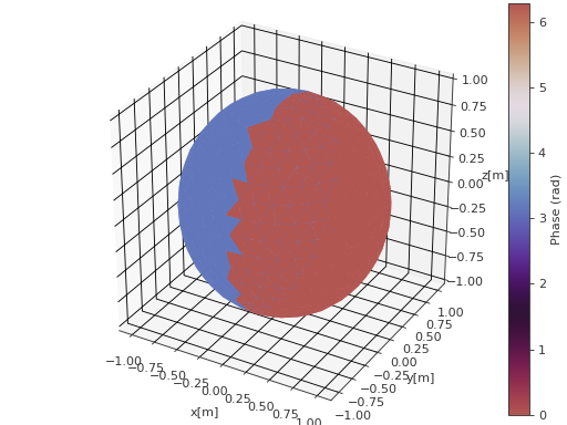
>>> import spharpy
>>> import numpy as np
>>> coords = spharpy.samplings.equal_area(n_max=0, n_points=500)
>>> data = np.sin(coords.azimuth) * np.cos(coords.elevation)
>>> spharpy.plot.balloon(coords, data, cmap_encoding='phase')
(
Source code,png,hires.png,pdf)
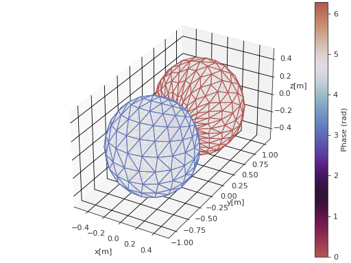
- spharpy.plot.balloon_wireframe(coordinates, data, cmap=None, colorbar=True, limits=None, cmap_encoding='phase', ax=None, style='light', **kwargs)[source]#
Plot data on a sphere defined by the coordinate angles theta and phi. The magnitude information is mapped onto the radius of the sphere. The colormap represents either the phase or the magnitude of the data array.
- Parameters:
coordinates (pyfar.Coordinates, spharpy.SamplingSphere) – Coordinates defining a sphere
data (ndarray, double) – Data for each angle, must have size corresponding to the number of points given in coordinates.
cmap (str,
matplotlib.colors.Colormap, optional) – Colormap used for the plot. IfNone(default), the colormap is automatically selected based on the value of cmap_encoding:'phase'usesspharpy.plot.phase_twilight, and'magnitude'uses the'viridis'colormap.colorbar (bool, optional) – Whether to show a colorbar or not. Default is
True.limits (tuple, list, optional) – Tuple or list containing the maximum and minimum to which the colormap needs to be clipped. If
None, the limits are set to the minimum and maximum of the data. Default isNone.cmap_encoding (str, optional) – The information encoded in the colormap. Can be either
'phase'(in radians) or'magnitude'. The default is'phase'.ax (matplotlib.axes.Axes or list, tuple or ndarray of matplotlib.axes.Axes) –
Axes to plot on.
NoneUse the current axis, or create a new axis (and figure) if there is none.
axIf a single axis is passed, this is used for plotting. If colorbar is
Truethe space for the colorbar is taken from this axis. The projection must be'3d'.[ax, ax]If a list, tuple or array of two axes is passed, the first is used to plot the data and the second to plot the colorbar. In this case colorbar must be
Trueand the projection of the second axis must be'rectilinear'. The first axis must meet the same conditions as for the case when a single axis is passed.
The default is
None.style (str) –
lightordarkto use the pyfar plot styles (seepyfar.plot.context) or a plot style frommatplotlib.style.available. Pass a dictionary to set specific plot parameters, for examplestyle = {'axes.facecolor':'black'}. Pass an empty dictionarystyle = {}to use the currently active plotstyle. The default islight.**kwargs (optional) – Additional arguments passed to the plot_trisurf function.
- Returns:
ax (matplotlib.axes.Axes, list[matplotlib.axes.Axes]) – If colorbar is
Truea list of two axes is returned. The first one is the axis on which the data is plotted, the second one is the axis of the colorbar. If colorbar isFalse, only the axis on which the data is plotted is returned.plot (matplotlib.trisurf) – The trisurf object created by the function.
cb (matplotlib.colorbar.Colorbar, None) – The Matplotlib colorbar object if colorbar is
TrueandNoneotherwise. This can be used to control the appearance of the colorbar, e.g., the label can be set bycolorbar.set_label().
Examples
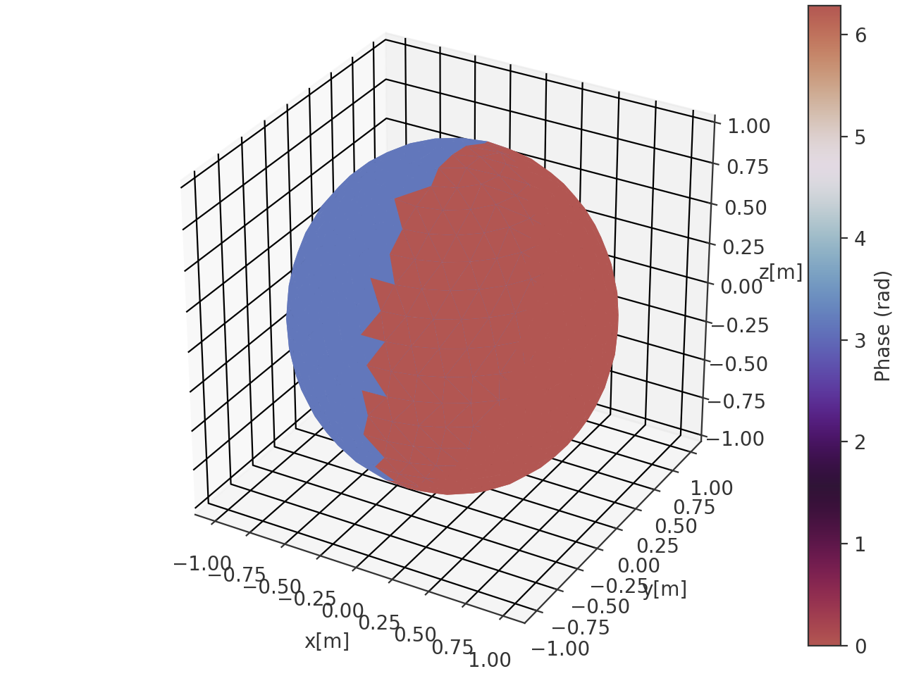
>>> import spharpy
>>> import numpy as np
>>> coords = spharpy.samplings.equal_area(n_max=0, n_points=500)
>>> data = np.sin(coords.azimuth) * np.cos(coords.elevation)
>>> spharpy.plot.balloon_wireframe(coords, data, cmap_encoding='phase')
(
Source code,png,hires.png,pdf)
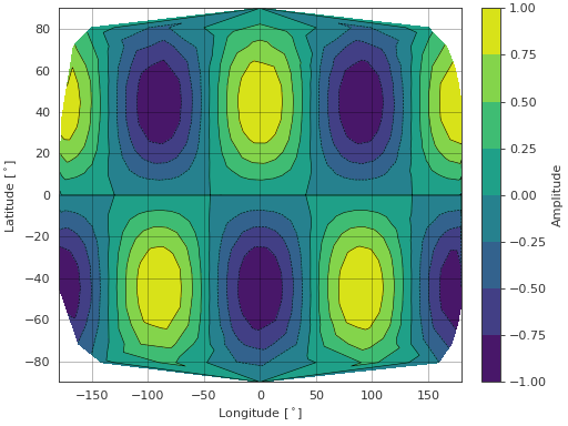
- spharpy.plot.contour(coordinates, data, cmap='viridis', colorbar=True, limits=None, levels=None, ax=None, style='light')[source]#
Plot the map projection of data points sampled on a spherical surface. The data has to be real-valued.
Notes
In case limits are given, all out of bounds data will be clipped to the respective limit.
- Parameters:
coordinates (pyfar.Coordinates, spharpy.SamplingSphere) – Coordinates defining a sphere
data (ndarray, double) – Data for each angle, must have size corresponding to the number of points given in coordinates.
cmap (str,
matplotlib.colors.Colormap, optional) – Colormap for the plot, see matplotlib.cm. Default is'viridis'.colorbar (bool, optional) – Whether to show a colorbar or not. Default is
True.limits (tuple, list, optional) – Tuple or list containing the maximum and minimum to which the colormap needs to be clipped. If
None, the limits are set to the minimum and maximum of the data. Default isNone.levels (int or array-like, optional) – Determines the number and positions of the contours. If an int n, use
matplotlib.ticker.MaxNLocator, which tries to automatically choose no more than n+1 contour levels between minimum and maximum numeric values of the plot data. If array-like, draw contour lines at the specified levels. The values must be in increasing order. Default isNone, the levels are chosen automatically by Matplotlib.ax (matplotlib.axes.Axes or list, tuple or ndarray of matplotlib.axes.Axes) –
Axes to plot on.
NoneUse the current axis, or create a new axis (and figure) if there is none.
axIf a single axis is passed, this is used for plotting. If colorbar is
Truethe space for the colorbar is taken from this axis. The projection must be'rectilinear'.[ax, ax]If a list, tuple or array of two axes is passed, the first is used to plot the data and the second to plot the colorbar. In this case colorbar must be
Trueand the projection of the second axis must be'rectilinear'. The first axis must meet the same conditions as for the case when a single axis is passed.
The default is
None.style (str) –
lightordarkto use the pyfar plot styles (seepyfar.plot.context) or a plot style frommatplotlib.style.available. Pass a dictionary to set specific plot parameters, for examplestyle = {'axes.facecolor':'black'}. Pass an empty dictionarystyle = {}to use the currently active plotstyle. The default islight.
- Returns:
ax (matplotlib.axes.Axes, list[matplotlib.axes.Axes]) – If colorbar is
Truea list of two axes is returned. The first one is the axis on which the data is plotted, the second one is the axis of the colorbar. If colorbar isFalse, only the axis on which the data is plotted is returned.cf (matplotlib.contour.QuadContourSet) – The contour plot object.
cb (matplotlib.colorbar.Colorbar, None) – The Matplotlib colorbar object if colorbar is
TrueandNoneotherwise. This can be used to control the appearance of the colorbar, e.g., the label can be set bycolorbar.set_label().
Examples
>>> import spharpy
>>> import numpy as np
>>> coords = spharpy.samplings.equal_area(n_max=0, n_points=500)
>>> data = np.sin(2*coords.colatitude) * np.cos(2*coords.azimuth)
>>> spharpy.plot.contour(coords, data)
(
Source code,png,hires.png,pdf)
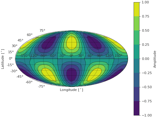
- spharpy.plot.contour_map(coordinates, data, cmap='viridis', colorbar=True, limits=None, projection='mollweide', levels=None, ax=None, style='light')[source]#
Plot the map projection of data points sampled on a spherical surface. The data has to be real.
Notes
In case limits are given, all out of bounds data will be clipped to the respective limit.
- Parameters:
coordinates (pyfar.Coordinates, spharpy.SamplingSphere) – Coordinates defining a sphere
data (ndarray, double) – Data for each angle, must have size corresponding to the number of points given in coordinates.
cmap (str,
matplotlib.colors.Colormap, optional) – Colormap for the plot, see matplotlib.cm. Default is'viridis'.colorbar (bool, optional) – Whether to show a colorbar or not. Default is
True.limits (tuple, list, optional) – Tuple or list containing the maximum and minimum to which the colormap needs to be clipped. If
None, the limits are set to the minimum and maximum of the data. Default isNone.projection (str, optional) – The projection of the map. Default is
'mollweide'. See Geographic Projections for more information on available projections in matplotlib.levels (int or array-like, optional) – Determines the number and positions of the contours. If an int n, use
matplotlib.ticker.MaxNLocator, which tries to automatically choose no more than n+1 contour levels between minimum and maximum numeric values of the plot data. If array-like, draw contour lines at the specified levels. The values must be in increasing order. Default isNone, the levels are chosen automatically by Matplotlib.ax (matplotlib.axes.Axes or list, tuple or ndarray of matplotlib.axes.Axes) –
Axes to plot on.
NoneUse the current axis, or create a new axis (and figure) if there is none.
axIf a single axis is passed, this is used for plotting. If colorbar is
Truethe space for the colorbar is taken from this axis. Projection should be one of the Geographic Projections.[ax, ax]If a list, tuple or array of two axes is passed, the first is used to plot the data and the second to plot the colorbar. In this case colorbar must be
Trueand the projection of the second axis must be'rectilinear'. The first axis must meet the same conditions as for the case when a single axis is passed.
The default is
None.style (str) –
lightordarkto use the pyfar plot styles (seepyfar.plot.context) or a plot style frommatplotlib.style.available. Pass a dictionary to set specific plot parameters, for examplestyle = {'axes.facecolor':'black'}. Pass an empty dictionarystyle = {}to use the currently active plotstyle. The default islight.
- Returns:
ax (matplotlib.axes.Axes, list[matplotlib.axes.Axes]) – If colorbar is
Truea list of two axes is returned. The first one is the axis on which the data is plotted, the second one is the axis of the colorbar. If colorbar isFalse, only the axis on which the data is plotted is returned.cf (matplotlib.contour.QuadContourSet) – The contour plot object.
cb (matplotlib.colorbar.Colorbar, None) – The Matplotlib colorbar object if colorbar is
TrueandNoneotherwise. This can be used to control the appearance of the colorbar, e.g., the label can be set bycolorbar.set_label().
Examples
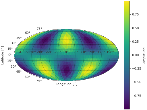
>>> import spharpy
>>> import numpy as np
>>> coords = spharpy.samplings.equal_area(n_max=0, n_points=500)
>>> data = np.sin(2*coords.colatitude) * np.cos(2*coords.azimuth)
>>> spharpy.plot.contour_map(coords, data)
(
Source code,png,hires.png,pdf)
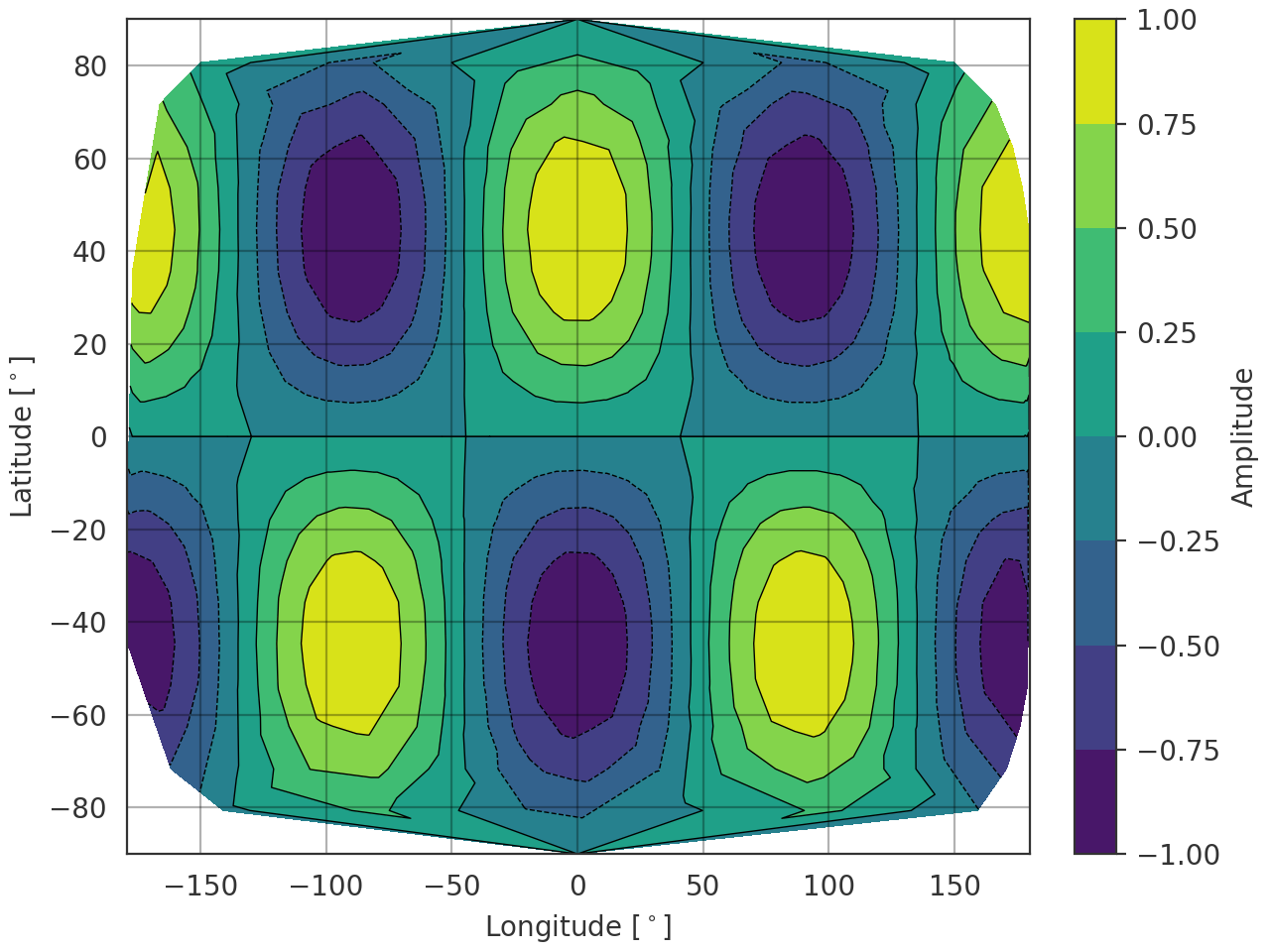
- spharpy.plot.pcolor_map(coordinates, data, cmap='viridis', colorbar=True, limits=None, projection='mollweide', refine=False, ax=None, style='light', **kwargs)[source]#
Plot the map projection of data points sampled on a spherical surface. The data has to be real.
Notes
In case limits are given, all out of bounds data will be clipped to the respective limit.
- Parameters:
coordinates (pyfar.Coordinates, spharpy.SamplingSphere) – Coordinates defining a sphere
data (numpy.ndarray, double) – Data for each angle, must have size corresponding to the number of points given in coordinates.
cmap (str,
matplotlib.colors.Colormap, optional) – Colormap for the plot, see matplotlib.cm. Default is'viridis'.colorbar (bool, optional) – Whether to show a colorbar or not. Default is
True.limits (tuple, list, optional) – Tuple or list containing the maximum and minimum to which the colormap needs to be clipped. If
None, the limits are set to the minimum and maximum of the data. Default isNone.projection (str, optional) – The projection of the map. Default is
'mollweide'. See Geographic Projections for more information on available projections in matplotlib.refine (bool, optional) – Whether to refine the triangulation before plotting. Default is
False.ax (matplotlib.axes.Axes or list, tuple or ndarray of matplotlib.axes.Axes) –
Axes to plot on.
NoneUse the current axis, or create a new axis (and figure) if there is none.
axIf a single axis is passed, this is used for plotting. If colorbar is
Truethe space for the colorbar is taken from this axis. Projection should be one of the Geographic Projections.[ax, ax]If a list, tuple or array of two axes is passed, the first is used to plot the data and the second to plot the colorbar. In this case colorbar must be
Trueand the projection of the second axis must be'rectilinear'. The first axis must meet the same conditions as for the case when a single axis is passed.
The default is
None.style (str) –
lightordarkto use the pyfar plot styles (seepyfar.plot.context) or a plot style frommatplotlib.style.available. Pass a dictionary to set specific plot parameters, for examplestyle = {'axes.facecolor':'black'}. Pass an empty dictionarystyle = {}to use the currently active plotstyle. The default islight.**kwargs (optional) – Additional arguments passed to the tripcolor function.
- Returns:
ax (matplotlib.axes.Axes, list[matplotlib.axes.Axes]) – If colorbar is
Truea list of two axes is returned. The first one is the axis on which the data is plotted, the second one is the axis of the colorbar. If colorbar isFalse, only the axis on which the data is plotted is returned.cf (matplotlib.tri.TriContourSet) – The contour plot object.
cb (matplotlib.colorbar.Colorbar, None) – The Matplotlib colorbar object if colorbar is
TrueandNoneotherwise. This can be used to control the appearance of the colorbar, e.g., the label can be set bycolorbar.set_label().
Examples
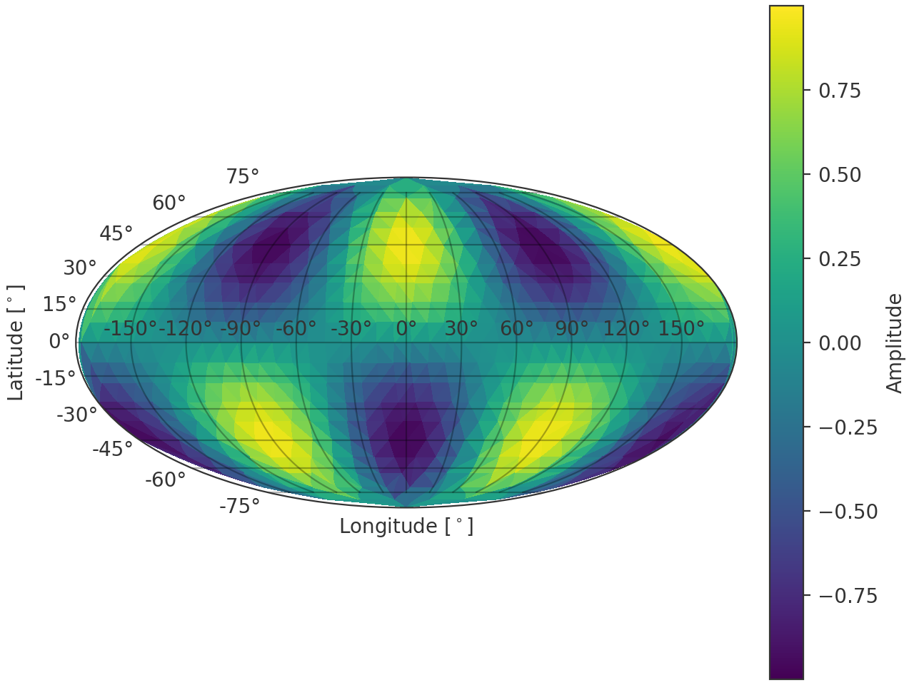
>>> import spharpy
>>> import numpy as np
>>> coords = spharpy.samplings.equal_area(n_max=0, n_points=500)
>>> data = np.sin(2*coords.colatitude) * np.cos(2*coords.azimuth)
>>> spharpy.plot.pcolor_map(coords, data)
(
Source code,png,hires.png,pdf)
- spharpy.plot.pcolor_sphere(coordinates, data, cmap=None, colorbar=True, limits=None, cmap_encoding='phase', ax=None, style='light', **kwargs)[source]#
Plot data on the surface of a sphere defined by the coordinate angles theta and phi. The data array will be mapped onto the surface of a sphere.
- Parameters:
coordinates (pyfar.Coordinates, spharpy.SamplingSphere) – Coordinates defining a sphere
data (ndarray, double) – Data for each angle, must have size corresponding to the number of points given in coordinates.
cmap (str,
matplotlib.colors.Colormap, optional) – Colormap used for the plot. IfNone(default), the colormap is automatically selected based on the value of cmap_encoding:'phase'usesspharpy.plot.phase_twilight, and'magnitude'uses the'viridis'colormap.colorbar (bool, optional) – Whether to show a colorbar or not. Default is
True.limits (tuple, list, optional) – Tuple or list containing the maximum and minimum to which the colormap needs to be clipped. If
None, the limits are set to the minimum and maximum of the data. Default isNone.cmap_encoding (str, optional) – The information encoded in the colormap. Can be either
'phase'(in radians) or'magnitude'. The default is'phase'.ax (matplotlib.axes.Axes or list, tuple or ndarray of matplotlib.axes.Axes) –
Axes to plot on.
NoneUse the current axis, or create a new axis (and figure) if there is none.
axIf a single axis is passed, this is used for plotting. If colorbar is
Truethe space for the colorbar is taken from this axis. The projection must be'3d'.[ax, ax]If a list, tuple or array of two axes is passed, the first is used to plot the data and the second to plot the colorbar. In this case colorbar must be
Trueand the projection of the second axis must be'rectilinear'. The first axis must meet the same conditions as for the case when a single axis is passed.
The default is
None.style (str) –
lightordarkto use the pyfar plot styles (seepyfar.plot.context) or a plot style frommatplotlib.style.available. Pass a dictionary to set specific plot parameters, for examplestyle = {'axes.facecolor':'black'}. Pass an empty dictionarystyle = {}to use the currently active plotstyle. The default islight.**kwargs (optional) – Additional arguments passed to the plot_trisurf function.
- Returns:
ax (matplotlib.axes.Axes, list[matplotlib.axes.Axes]) – If colorbar is
Truea list of two axes is returned. The first one is the axis on which the data is plotted, the second one is the axis of the colorbar. If colorbar isFalse, only the axis on which the data is plotted is returned.plot (matplotlib.trisurf) – The trisurf object created by the function.
cb (matplotlib.colorbar.Colorbar, None) – The Matplotlib colorbar object if colorbar is
TrueandNoneotherwise. This can be used to control the appearance of the colorbar, e.g., the label can be set bycolorbar.set_label().
Examples
>>> import spharpy
>>> import numpy as np
>>> coords = spharpy.samplings.equal_area(n_max=0, n_points=500)
>>> data = np.sin(coords.colatitude) * np.cos(coords.azimuth)
>>> spharpy.plot.pcolor_sphere(coords, data, cmap_encoding='phase')
(
Source code,png,hires.png,pdf)
- spharpy.plot.phase_twilight(lut=512)[source]#
Cyclic color map for displaying phase information.
This is a modified version of the twilight color map from matplotlib. The colormap is rotated such that \(0\) is encoded as red hues, while \(\pi\) is encoded as blue hues.
- Parameters:
lut (int, optional) – Number of entries in the lookup table of colors for the colormap. Default is
512.- Returns:
Colormap instance.
- Return type:
- spharpy.plot.scatter(coordinates, ax=None, style='light', **kwargs)[source]#
Plot the x, y, and z coordinates of the sampling grid in the 3d space.
- Parameters:
coordinates (pyfar.Coordinates, spharpy.SamplingSphere) – The coordinates to be plotted
ax (matplotlib.axis, None, optional) – The matplotlib axis object used for plotting. By default
None, which will create a new axis object.style (str) –
lightordarkto use the pyfar plot styles (seepyfar.plot.context) or a plot style frommatplotlib.style.available. Pass a dictionary to set specific plot parameters, for examplestyle = {'axes.facecolor':'black'}. Pass an empty dictionarystyle = {}to use the currently active plotstyle. The default islight.**kwargs (optional) – Additional keyword arguments passed to the scatter function.
- Returns:
ax – The axis object used for plotting.
- Return type:
matplotlib.axis
Examples
>>> import spharpy
>>> coords = spharpy.samplings.gaussian(n_max=5)
>>> spharpy.plot.scatter(coords)
(
Source code,png,hires.png,pdf)
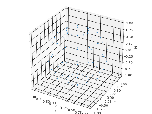
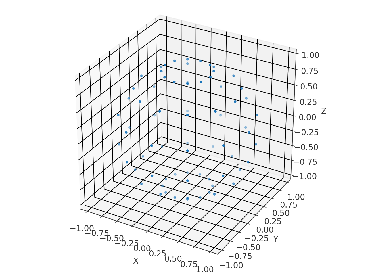
- spharpy.plot.voronoi_cells_sphere(sampling, round_decimals=13, ax=None, style='light')[source]#
Plot the Voronoi cells of a Voronoi tesselation on a sphere.
- Parameters:
sampling (pyfar.Coordinates, spharpy.SamplingSphere) – Sampling as SamplingSphere object
round_decimals (int) – Decimals to be rounded to for eliminating duplicate points in the voronoi diagram. Default is
13.ax (AxesSubplot, None, optional) – The subplot axes to use for plotting. The used projection needs to be
'3d'.style (str) –
lightordarkto use the pyfar plot styles (seepyfar.plot.context) or a plot style frommatplotlib.style.available. Pass a dictionary to set specific plot parameters, for examplestyle = {'axes.facecolor':'black'}. Pass an empty dictionarystyle = {}to use the currently active plotstyle. The default islight.
- Returns:
ax – The axis object used for plotting.
- Return type:
matplotlib.axis
Examples
>>> import spharpy
>>> coords = spharpy.samplings.gaussian(n_max=5)
>>> spharpy.plot.voronoi_cells_sphere(coords)
(
Source code,png,hires.png,pdf)
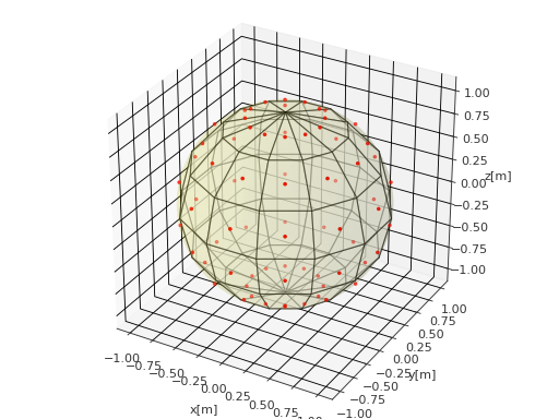
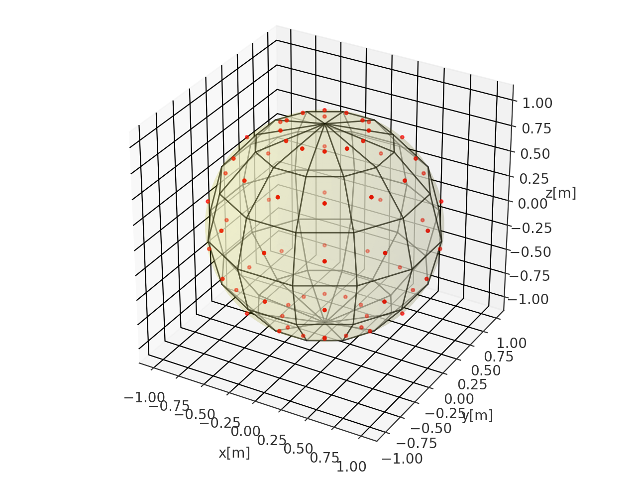